


Each year for over two decades the U.S. brand Pantone proposes a color meant to inspire production decisions of other companies in areas such as fashion, decorating, design and food. The color is chosen after a thorough analysis by its experts, grouped together under the Pantone Color Institute (PCI), taking into consideration new influences in the entertainment industry, socio-cultural and economic movements, emerging names in the arts, trendy tourism destinations and lifestyles.
The idea is to choose a color that has psychological and emotional meaning reflecting what is happening with people around the world. Based on this criteria, PANTONE 17-3938 Very Peri matches the described profile perfectly. “As we move into a world of unprecedented change, the selection of this color brings a novel perspective and vision of the trusted and beloved blue color family, encompassing the qualities of the blues, yet at the same time with its violet red undertone. [It] displays a sprightly, joyous attitude and dynamic presence that encourages courageous creativity and imaginative expression,” affirms Leatrice Eiseman, Executive Director of the PCI.
In nature, this color can be found in several fruits and flowers due to their high content of flavonoids and anthocyanins, substances with numerous health benefits. For instance, the black current is renowned for its antioxidant properties, preventing some types of cancer and reducing cholesterol levels in the body. Other examples include grapes and açai, which help control blood pressure and prevent premature aging of cells, and lavender, a favorite when seeking calm and wellbeing.
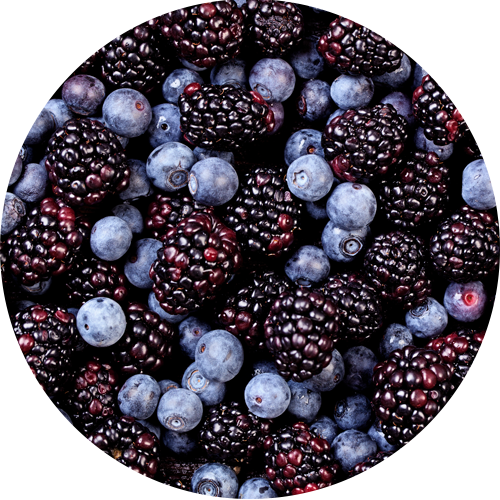
Brands are leveraging the surprising properties of some foods, adding them to drinks, desserts, ice creams and yogurts, through flavor or color. Some examples include blueberries, the most common variety added to yogurt worldwide, or the more traditional blackberry, a favorite of many consumers. Another, more innovative proposal is the jabuticaba, a fruit widely available in Brazil.
These same emotions cited by Pantone can be found in scents for the Beauty category (personal care and fine perfume lines), where different brands use them to create their own products. The post-pandemic context is a clear example, since people today want to enjoy life to the fullest, feel whole, travel the world, get together with others, have a good time and relax. These needs explain the success of trendy, mood-boosting fragrances in formats as diverse as shampoos, soaps, lotions and perfumes.
To relax, there is nothing like the aroma of flowers like irises, violets and lavender, with tones ranging from light blue to purple, complemented by notes of chamomile and vanilla. If the intention is to energize, the best options are citric (mandarin, grapefruit, orange), fruity (papaya, pear) or tropical (coconut, mango, passion fruit) scents, which sometimes have an olfactory intensity that invokes places that nourish us with positive, vital energy. In other cases, they are combined with notes of white tea or bergamot to lend elegance and sophistication.
![]()
![]()

